![]()
I am a landlord’s nightmare. I have a cat that likes to destroy carpet edges and window screens. I like painting the walls fuchsia (just one, really) and secretly planting flowers on the property. Oh, and I use a lot of nails. Really, really a lot of nails. This doesn’t include the curtains that I hung out on our last porch, the chandelier in the ceiling, or the chunky floating shelves.
Nope, I’m just talking about picture frames. I like my frames in clusters and I like a lot of them.
(Okay, in reality, I am probably not a landlord’s nightmare. Greg and I are quiet, we pay rent on time, and we always patch the walls when it’s time to leave).
My first few stabs at decorating revolved around symmetric clusters of art. Squares and rectangles in rows and columns. I knew I could always make frames look better if I put them close together, in a grid. There wasn’t much thinking involved, and I was generally pleased with the results.
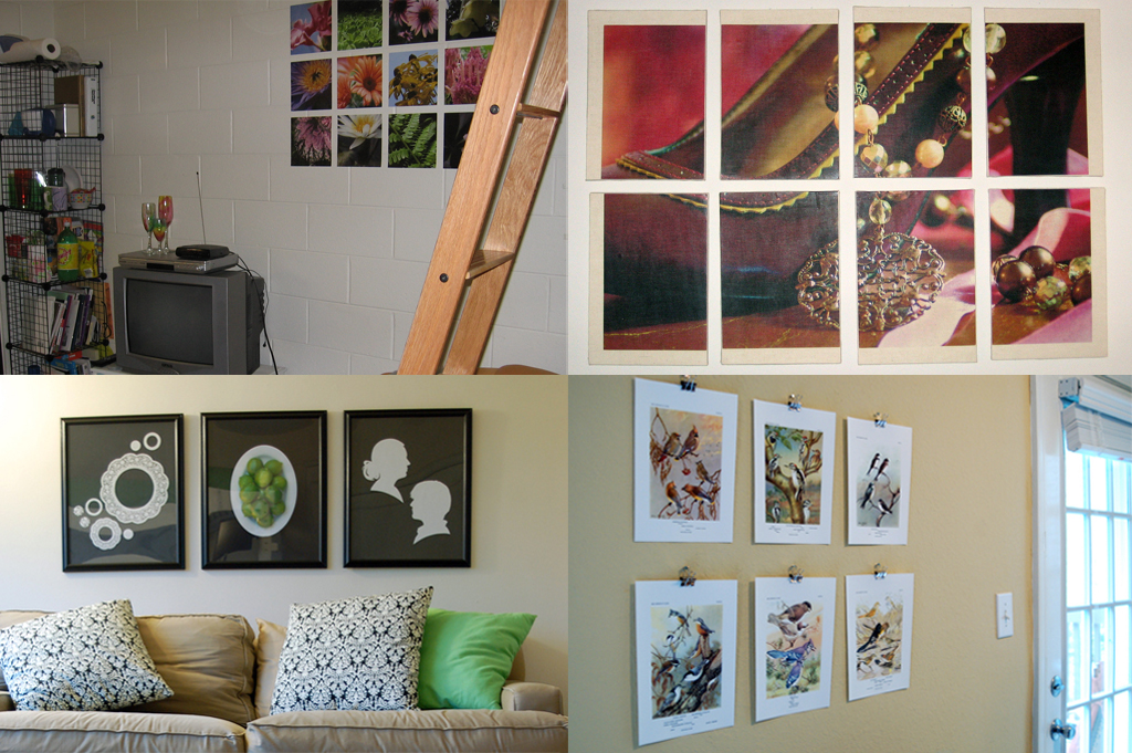
(Clockwise from upper left: dorm room, 1st apartment after college, 1st Atlanta apartment, 2nd Atlanta apartment)
In the last couple places I’ve lived (the only ones I’ve shared with a husband and really tried to decorate), I’ve gotten quite a bit more adventurous in my picture arranging. It may be partially due to the painstaking precision with which Greg helped to hang perfect little grids of frames, and how disappointed (/frustrated/angry) he got when, despite a lot of measuring, the frames weren’t exactly aligned. But probably not. I think I just graduated to a new, slightly-more-complex phase.
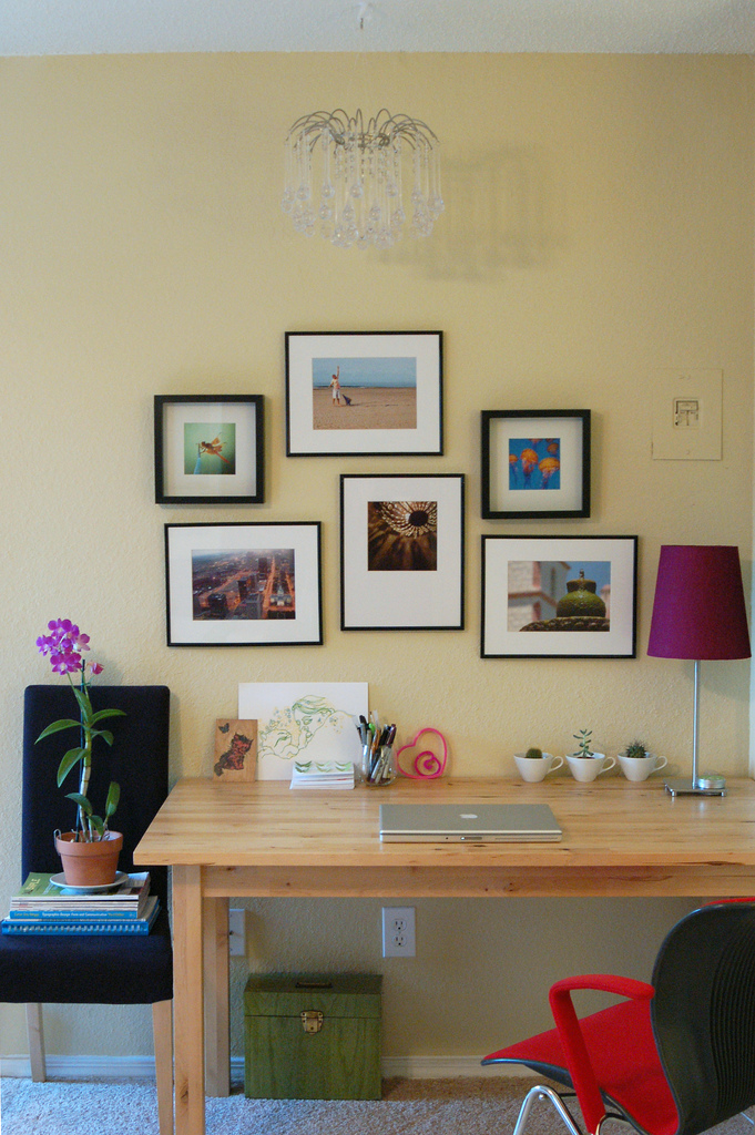
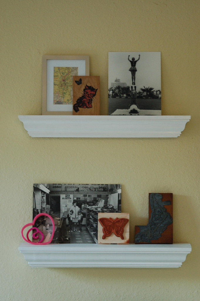

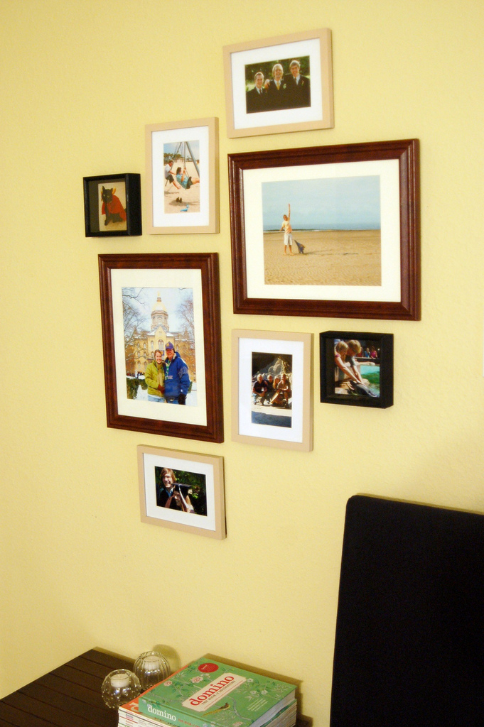
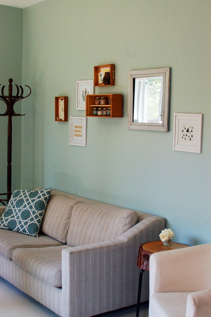
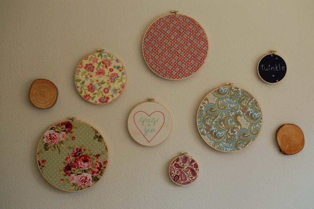
Several collages later, here’s what I’ve learned:
1. Start with arranging the frames/art/objects on the floor. It will show you how the art looks together, how wide the arrangement will span, and help you decide how much space looks good between frames. Photograph it, move the pieces around and photograph it again. Look at the pictures on your computer screen and choose a favorite.
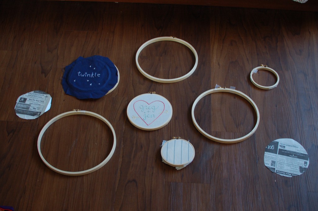
2. Use newspaper to test your arrangement on the wall (or scrap paper or paper bags). I can’t recommend this highly enough! Lay your frames down on the newspaper, trace and cut them out. Use a little tape and hang those perfectly-sized newspaper pieces on the wall where you hope to put your frames. My layouts never transfer perfectly from the floor to the wall, but any issues (size, spacing or balance) become immediately clear when I step back and see the newspaper collection on the wall.
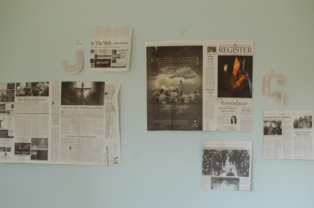
3. Leave the arrangement and come back to it. I find that this is also true in writing and graphic design — sometimes you just need to take a fresh look. Leave the newspaper arrangement up overnight and see if you still like it in the morning. If nothing else, note your new “first” reaction to it — if something seems out of place, you can correct it.
4. Pick the proper hardware. We love, love, love monkey hooks for heavy things. You can pick them up at any major hardware store and they’re so worth the extra cost. They make smaller holes and hold much more weight than the average nail.
5. Mark where the holes will go: another great advantage to using newspaper is that it serves as a place to mark, measure and jot notes as you hang things. It definitely beats cleaning the pencil marks off the wall! Another tip: to align pictures vertically, put the top nail in first. Then you can tie a string with any little weight attached to it and mark the spot for lower frames perfectly.
6. Start putting in nails! You can nail straight through the newspaper and just tear the paper down when everything is set.
Hey Jennifer! I just heard about your blog this week and I love it! Incidentally I’m getting ready to possibly hang some frames in the near future and I found this post really helpful. Thanks for taking the time to write it out, and please keep more of them coming!
Perfect timing! Good luck with your frames!